Posts

Final Evaluation

This is the evaluation of my final production in which I answer seven questions on how I created my media product and the ways it represents different groups and audiences, the skills I have learnt and how I feel I have progressed from my preliminary

Final Production

Image
After getting feedback from my target audience I went on to plan and produce my final production. Early on I had decided on a minimalistic style for my cover and planned on taking a photograph good enough to be the centre stage of the cover. I realised that I wanted to have a simple colour scheme and settled on black and white with other colours used sparingly. I felt that although this isn't entirely conventional for a music magazine the look I wanted was simple and elegant and by using such a simple colour scheme I would be able to work better on the layout and quality of my photos rather than having the focus on an overwhelming spectrum of colour. I had an idea to cover my models in coloured dots as I wanted there to be an interesting element to the photo so the minimalistic look wouldn't seem too dull. I took several photos in order to have enough to decide on which to use for my cover, contents and double page spread: several of the 30 photos I took are below: (Final fro...

Final Production - Focus Group

Image
Final Production - Mock Up I created my final production cover, contents page and double page spread and pitched it to my focus group to see if there were any small details they wanted changing or editing. Cover: Contents: Double Page Spread:  My focus group picked out on some small issues they wanted me to alter: Contents: Make the image bigger to fill the white space Make the masthead smaller as it overshadowed the image Contents: Align the images on the right and have them the same shape and size as the arms and text created the curving line and having a straight line of images would contrast this well and look more uniform Make the page numbers higher as the magazine appears to be very short Double Page Spread: Add a page number to make it easily identifiable

Final Production Logistics

To take my final photographs I needed to organise having all of my models in the same place at the same time with all the equipment I required. I needed: My main model alongside six others Neon coloured paints Plain white tshirts Camera Studio lighting Plain white background To ensure I had all these things ready for the photo shoot, I arranged a day and time to meet my models and requested that they all bring a plain white tshirt. I bought the paints and booked the camera and media room for the same day in order to have a place to stage the photos. The media room had the white background and specialised lighting I needed, in particular a photography lamp with seven bulbs that could be controlled individually to create different light.

Canon EOS 750D Camera Research

Image
The Canon EOS 750D is the camera I have chosen to take my final production photographs with, it is capable of taking high quality photos and is a camera made for those with little experience such as myself. In order to fully understand how to work it to it's highest standard I have done some research on it's specifications. The camera is a DSLR of 24.7 megapixels with a wide sensitivity range of 100-12800 and a shutter speed of 1-4000s. To use the camera properly I looked into changing the shutter speed, aperture and ISO and researched the different pre set modes for taking different photos. Shutter Speed - This is the length of time the shutter is open and exposed to light when taking a photograph, it can be altered by turning the mode dial to "M" and selecting the shutter speed options ISO - The ISO measures the sensitivity of an image sensor, the lower the ISO the less sensitive the camera is to light and the finer the grain. Higher ISO settings are usually...

Focus Group

Image
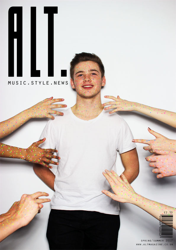
I formed a focus group of 20 people within my target audience to get feedback on ideas for names, colour schemes and themes among many other things I made a group chat to communicate with each member of the group directly, enabling me to send mock ups and photos to everyone at the same time and get an instant response. The first ideas I pitched to my group were several different potential names of the magazine which were as follows; Chord Alt. Amped Wave Switch The response was varied but the end result proved the most popular name to be "Alt." with 7 people choosing it as their preferred title The next task was to decide on a font to use, I tested several different ones and chose to pitch the following to my group:    (Sacco Semi Bold)      (San Frediano)  (Electricity)    (Zerocalcare) Again, a varied response but the Sacco Semi Bold font proved most popular with 6 votes, re...

Target Audience and Demographics

To decide upon my target audience I researched the audiences of several of the magazines I have already studied (NME, Rolling Stone and Billboard) and also those of style magazine Vogue and as I intend to incorporate style and fashion elements into my magazine. Readership profiles are a good way to find out the exact type of people who are buying and reading a magazine and I used them in my research: NME Male: 69% Female: 31% Average age: 24 years old Full time workers: 52% Part time workers: 7% Students: 29% On average NME readers spend in a year: £152 on footwear £532 on clothing £66 on DVDs £170 on digital cameras £1229 on music equipment The average NME reader will spend 19 hours on the internet per week with 94% using the internet and 84% receiving TV or satellite signals From this research I concluded that the people reading NME are largely young adults either in education or just entering full time work. They have particular interest in fashion (shown ...